January 26, 2011
Those who follow Viva Woman on Facebook may have noticed that I’ve started “exposing” products that claim to be organic but do not appear so based on their ingredient list. So yes, while I am no expert in reading the ingredient list but it is the first thing I look at when I am considering if I should test or purchase a product. I hate it when the ingredient list are not reader friendly and printed in really small prints. And because I’m into natural and organic products, information like expiry date is also very important. Today, I’ll share with you some of the good packaging practice I’ve come across recently. Hopefully, more manufacturers will take note of such details when marketing their skin care products.
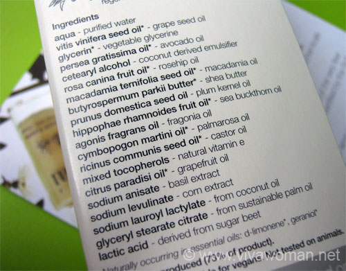
Simplify the ingredient list
I have no idea what is persea gratissima oil but I do know avocado oil. I love ingredients that are easy to understand and I was really impressed by the ingredient listing on Pai Fragonia & Sea Buckthorn Instant Hand Therapy Cream. A side of the box was dedicated to the ingredients and while jargons were employed, they were explained and even though I may not know each ingredient, I know it looks pretty natural at a glance.
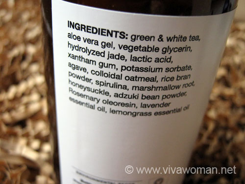
Unclutter the ingredient list
I appreciate manufacturers who bother to list the ingredients boldly at a section of the product such that I can always refer to it easily. Marie Veronique Organics does a good job of this on all their products with lots of white space and no clutter. Â This makes it so reader friendly.
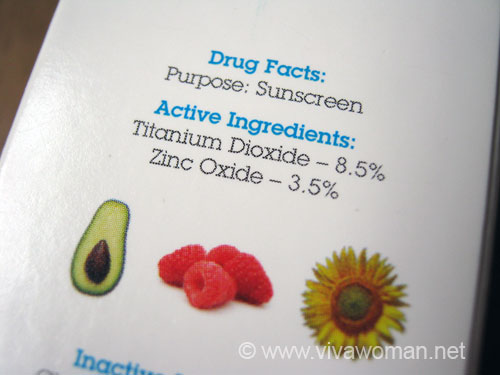
Highlight the active ingredients prominently
This is particularly important for sunscreens. Many a times, the active ingredients are buried in the entire list that it will have to take an expert to pick them out. I know the active ingredients of sunscreens but I don’t necessary know them by their variations. In fact, I sometimes have to run a search just to be sure. Hence, those brands that bother to list their active ingredients clearly complete with the percentage gets my thumbs up. Many mineral sunscreens follow this format and an example is the Vive Sana Solar to Polar Ultra Sun Care I reviewed recently.
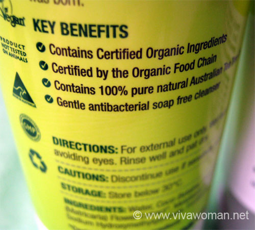
List key benefits clearly
While description is good but in today’s context where we are always inundated with lots of information on a daily basis, basic design elements should be employed in product packaging. The easier I can understand the product properties, the higher the probability of purchasing that product. The Thursday Plantation products do quite an effective job using this technique through simple bullet points.
Emphasize the key information creatively
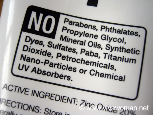
Most natural and organic products will highlight what they do not contain. Some do it better than others. One good example I’ve come across is Suntegrity All Natural Moisturizing Body Protection SPF30 where ingredients the product do not contain are highlighted within a box and the word NO is printed in reversed white. I find that really neat and effective.
Print clear and specific best by date
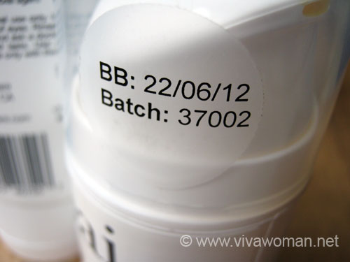
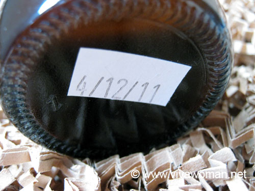
This is not only important for natural and organic products but all other products as well. It irritates me to find only batch numbers printed on a product packaging and most of the time, these batch numbers are in secret codes that are absolutely impossible to decode. And that little icon which tells me the product is good for 6 months or 12 months after opening is also useless to me if I don’t know when the product was manufactured. So I appreciate products with either manufacturing date or used by date clearly indicated to facilitate my purchasing decision.
Be honest and transparent
I don’t think I’m being picky or fussy here. I believe many of you place emphasis on the information that is printed on the product packaging. Granted that there is a cost involved in doing all these things but most of such costs are passed on to the consumers anyway so why not do a better job out of it. And for goodness sake, please stop using labels like “certified organic” when your products clearly aren’t so. Honesty is always the best policy!
Eau Des Merveilles Constellation
Posted by: futyrywoke at
06:41 AM
| No Comments
| Add Comment
Post contains 707 words, total size 6 kb.
33 queries taking 2.0293 seconds, 51 records returned.
Powered by Minx 1.1.6c-pink.


